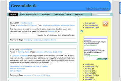
My verdict: back to the drawing board for Apple 😉 . If I released a turd like this, I think I’d be invited into my director’s office for a little chat. Below you can see how this site gets rendered. Basically every Header text is simply omitted. They’re just not there. At least the javascript seems to work.

Furthermore, I think it’s a little bit crazy to simple take an Apple program and port that directly to the Windows Environment, same interface, same font rendering etc.. For example it’s pretty tough to resize the browser window, you need to place the mouse pointer exactly at the little bottom triangle thingy in the right bottom. Also some dialogues have the OK and CANCEL reversed from what you’d expect in windows. And the look just stands out like a sore thumb compared to the other programs I have opened.
And to call this a Beta release is beyond a joke, it’s way too buggy and incomplete for that. I don’t see why apple is using up resources to release a browser for windows in the first place, but why they hurt their own reputation by releasing this piece of crap is beyond me… BTW I never use Safari in my Mac Mini, never liked it. Camino is so much better…
More links:
Wired Review
Scott Hanselman’s review
joel on software
Channel 9 Thread